2018 - 2020
URBN Content Components
COMPANY
Anthropologie, Free People, Urban Outfitters
MY ROLE
Lead Product Designer
TEAM
Ashley Cecere - Product Manager
Deirdre Ligget - Business Analyst & Scrum Master
Tom Bicknell - Tech Lead
Jack Keller - Developer
Pete Rancourt - QA
PROBLEM STATEMENT
How might we create a more cohesive and standardized content component library in our CMS for stakeholders, so that they have flexibility and consistency when designing complex layouts for web and mobile?
BAckground
White Label
Design Approach
Urban Outfitters, Anthropologie and Free People are three distinct brands that are under the URBN portfolio. In 2018 we began the transition to replatforming the three brands onto Vue (PWA - Progressive Web Apps) from Angular (Monoweb).
Through testing and data, it was determined that Vue provided speed and efficiency for the customers. My product team got tasked with auditing and pulling data of the current content components on Angular and rebuilding them in Vue. In addition to creating parity between components, we also decided to improve the functionality and overall CMS architecture of the new components.

Data & Analytics
We began by evaluating the usage of the content component for each brand on our Angular platform. Before matching 1 to 1, we wanted to make sure we were building useable and functional components that had positive conversions. The data was taken from Google Analytics and Contentful (CMS) usage, a few months before we decided to build out this feature (January 2019 - May 2019).
Monoweb Contentful Components
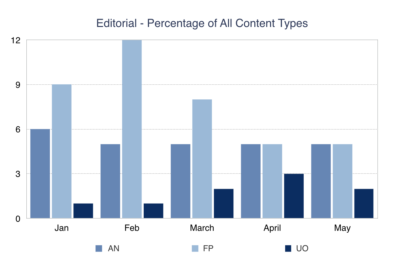
Editorial Component
- Anthropologie:
- 287 Editorials Components Live on Site
- 4.6 M session views
- 4.9% conversion rate
- Free People:
- 281 Editorials Components Live on Site
- 1.9 M session views
- 4.2% conversion rate
- Urban Outfitters:
- 89 Editorials Components Live on Site
- 270K session views
- 5.06% conversion rate
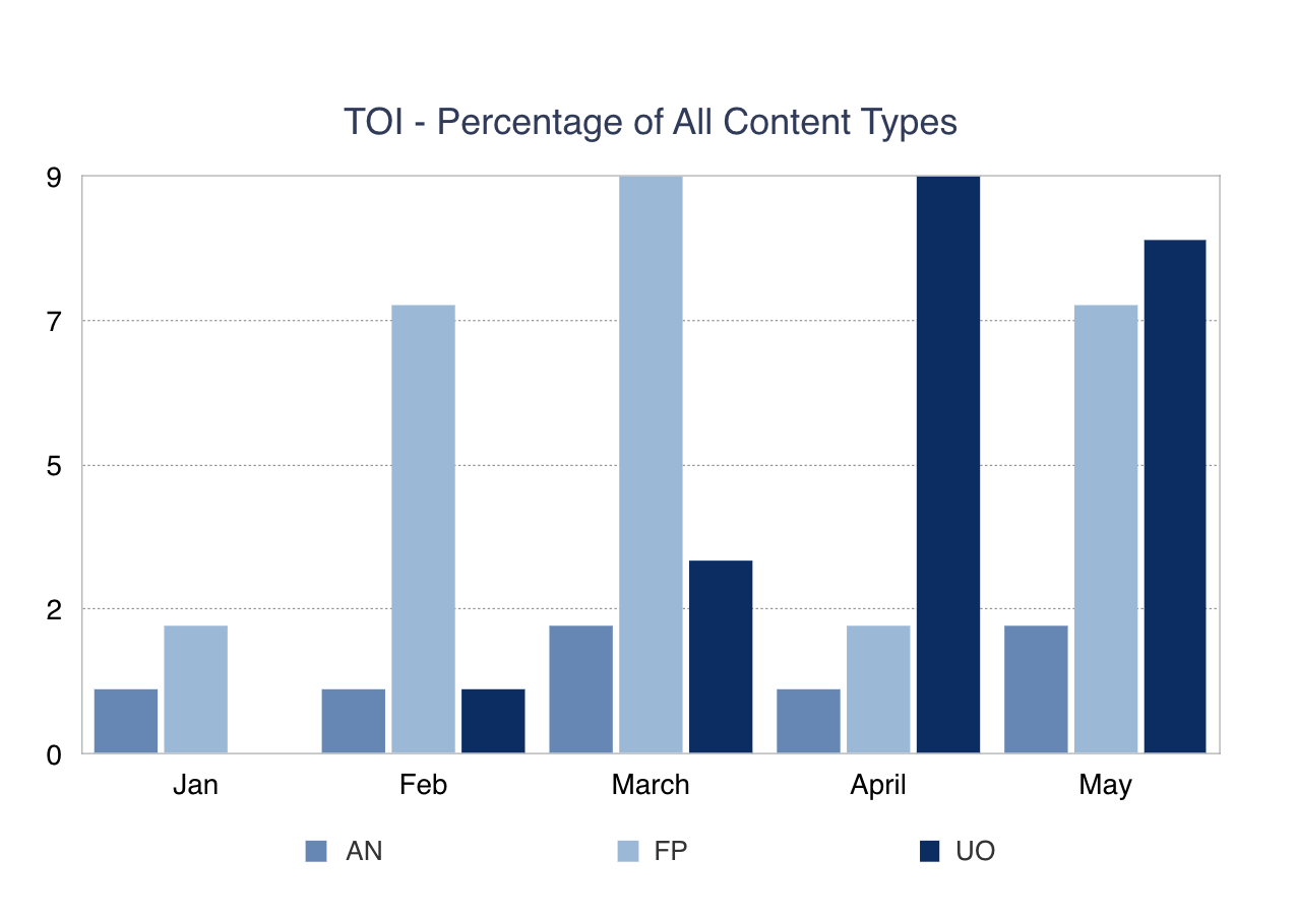
Monoweb Contentful Components
Text Over Images
- Anthropologie
- 68 Text Over Images Live on Site
- 1,457 session views
- 1.65% conversion rate
- Free People
- 250 Text Over Images Live on Site
- 1.7 M session views
- 4.1% conversion rate
- Urban Outfitters
- 271 Text Over Images Live on Site
- 454K session views
- 2.6% conversion rate
Strategic Goals
How can we strategically
improve content components?
1. Design for modular customization
The content components need to be flexible and customizable so that the Content Owners and Brand Designers can easily go into Contentful (CMS) and build out various pages and layouts while still allowing brand expression.
2. Promote best web practices
The content components need to meet a11y web accessibility standards and promote best user experience practices.
3. Conversions
The content components should increase revenue and click-through rate to the point of purchase. We should not see a decline in conversion rates from the stats above in the new platform.
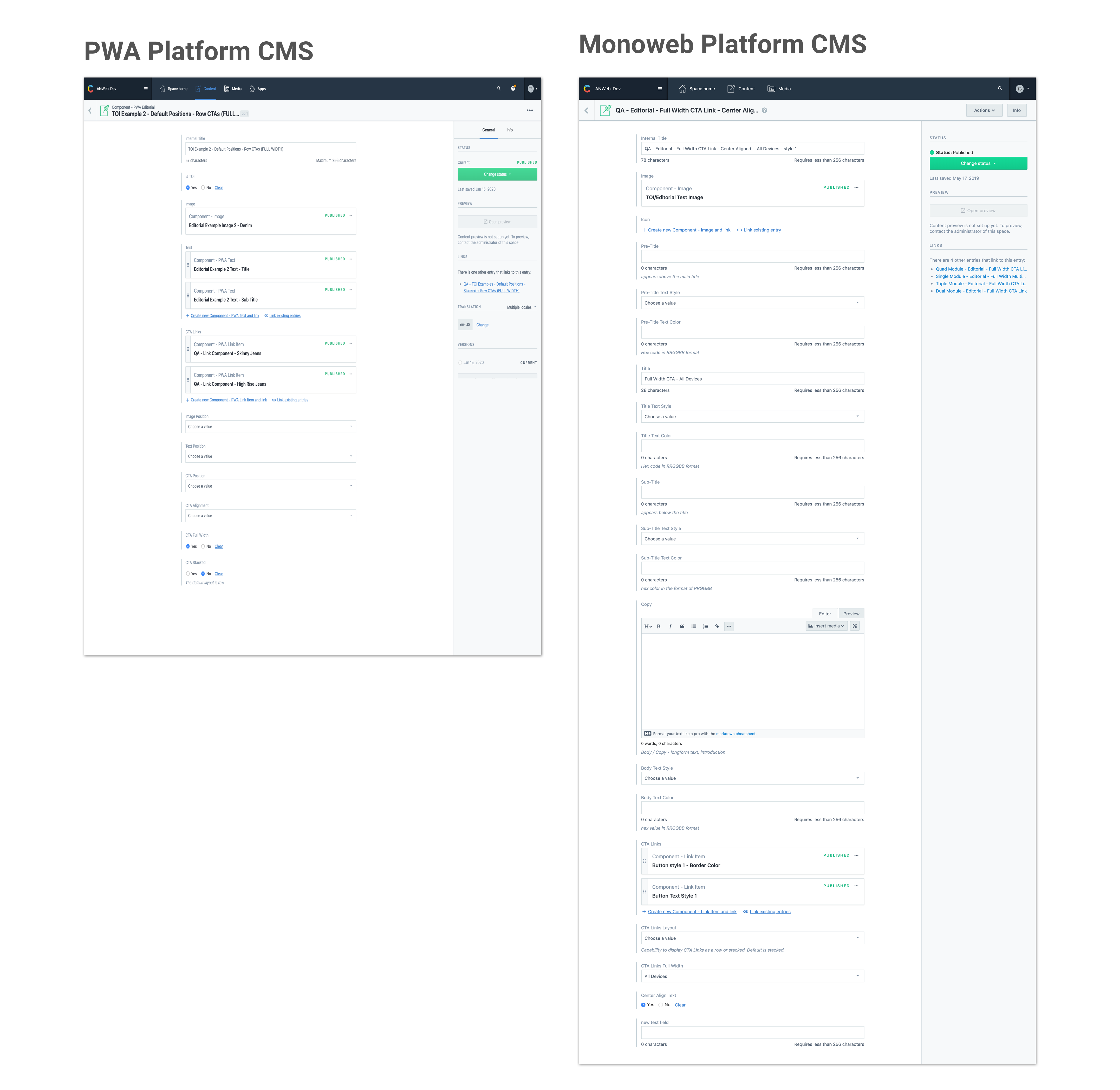
Content Management System
Contentful CMS
For both platforms we used Contentful as the Content Management System (CMS) for Anthropologie, Urban Outfitters, and Free People. My teams goal was to reduce time and streamline the workflow for Content Owners when updating, creating, and managing content on the site. For a similar content component designed in both platforms, we reduced the amount of steps a Content Owner needs to take to publish the content. We decided to combine different features and create a nesting component architecture to expedite the process.
- In Vue/PWA (the left image), Content Owners and Brand Designers take less steps to produce content. My team was able to consolidate and remove repetitive editing capabilities.
- We did not take away any functionality in Vue but rather added a more efficient process.
- Improved the organization and restructured the architecture of the CMS to create reusable styles.
- The Angular/Monoweb (the right image) is more cumbersome and takes a while for users to fill out the content.
Contentful CMS
Content Components
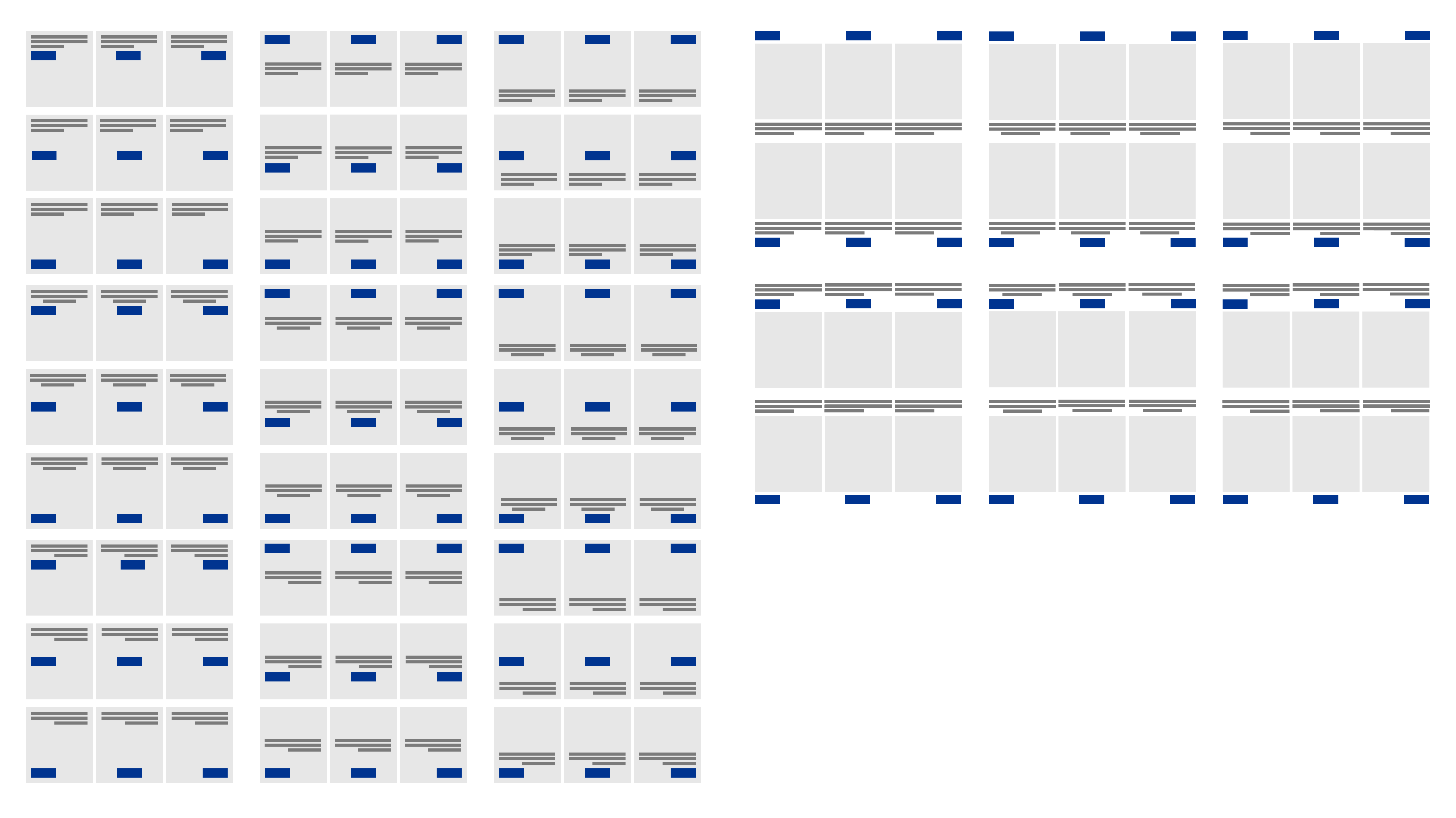
The content component library has a lot of different components (see image) to allow Content Owners and Designers to create functional yet customizable layouts on content pages.
The dropdown list is the amount of components the Content Owners and Designers are able to use when creating their content pages.
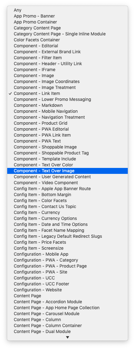
My goal as a Product Designer was to create a systematic content system so that the Content Owners & Brand Designers could create customizable layouts in our CMS.
Contentful Components
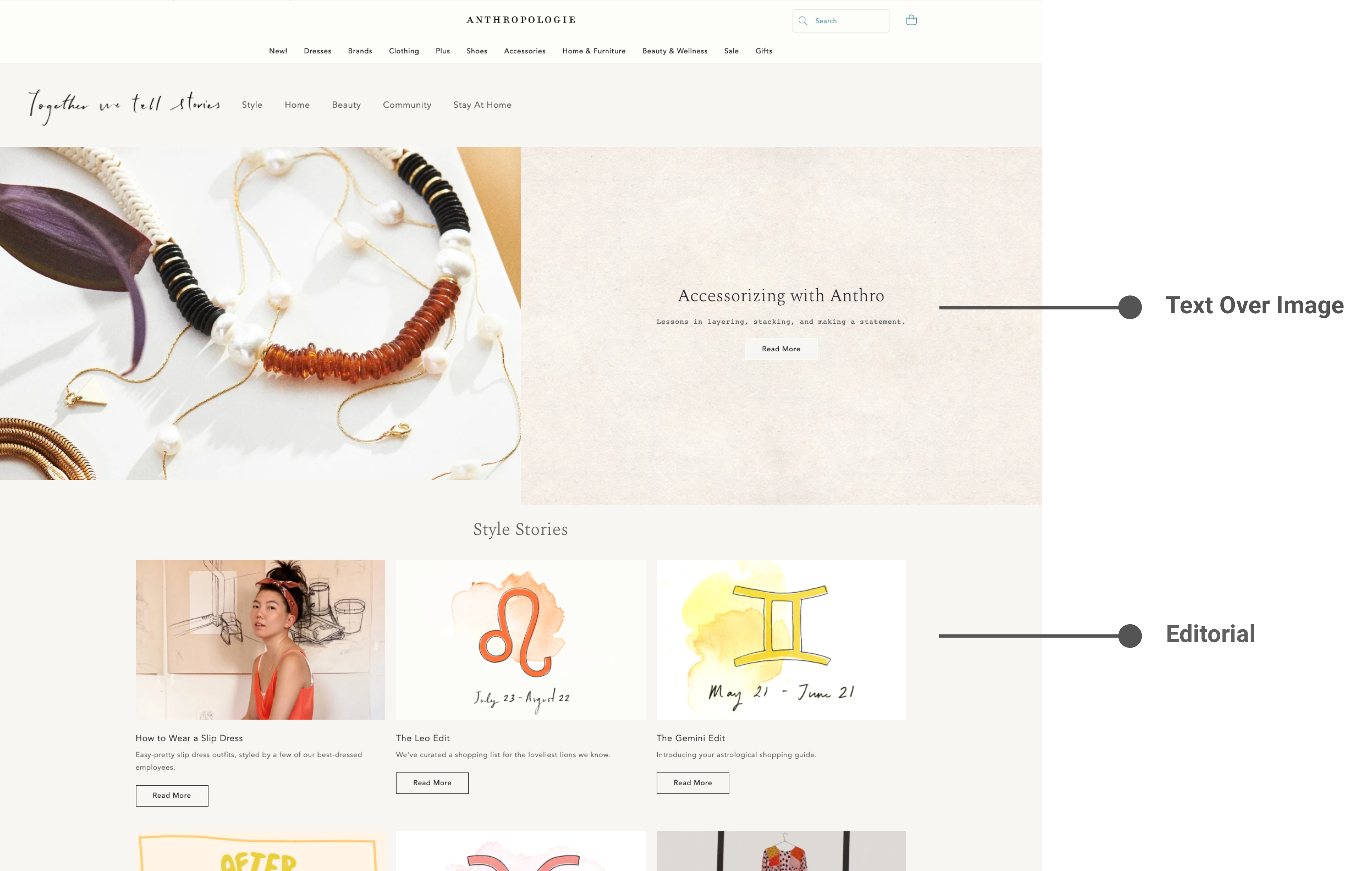
Editorial & TOI Component
The most commonly used component is the editorial component. The editorial component and text over image (TOI) component are the most used on the site. From the front-end, the components look similar.
UX Design & Strategy
Wireframes
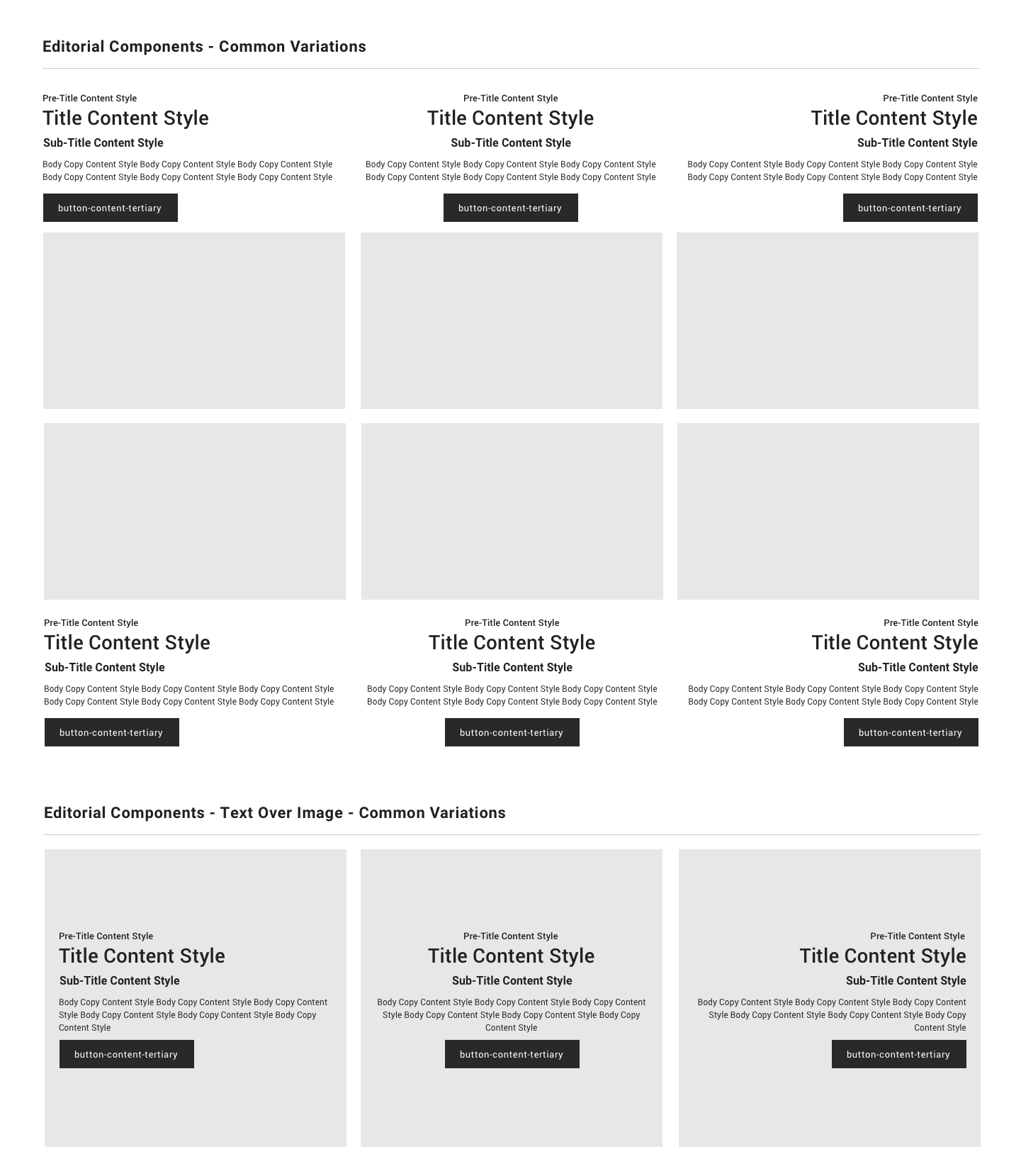
The brands generally keep editorial compomnents to one of the six design variations and for text over images to one of the three design variations.
UX DESIGN & STRATEGY
Updated Editorial Component Variations
Below are all the variations of CTA and text alignments that a Content Owner could choose in our CMS to create unique content layouts. (left) are text over image and (right) are editorials.
UI Designs & Content Strategy
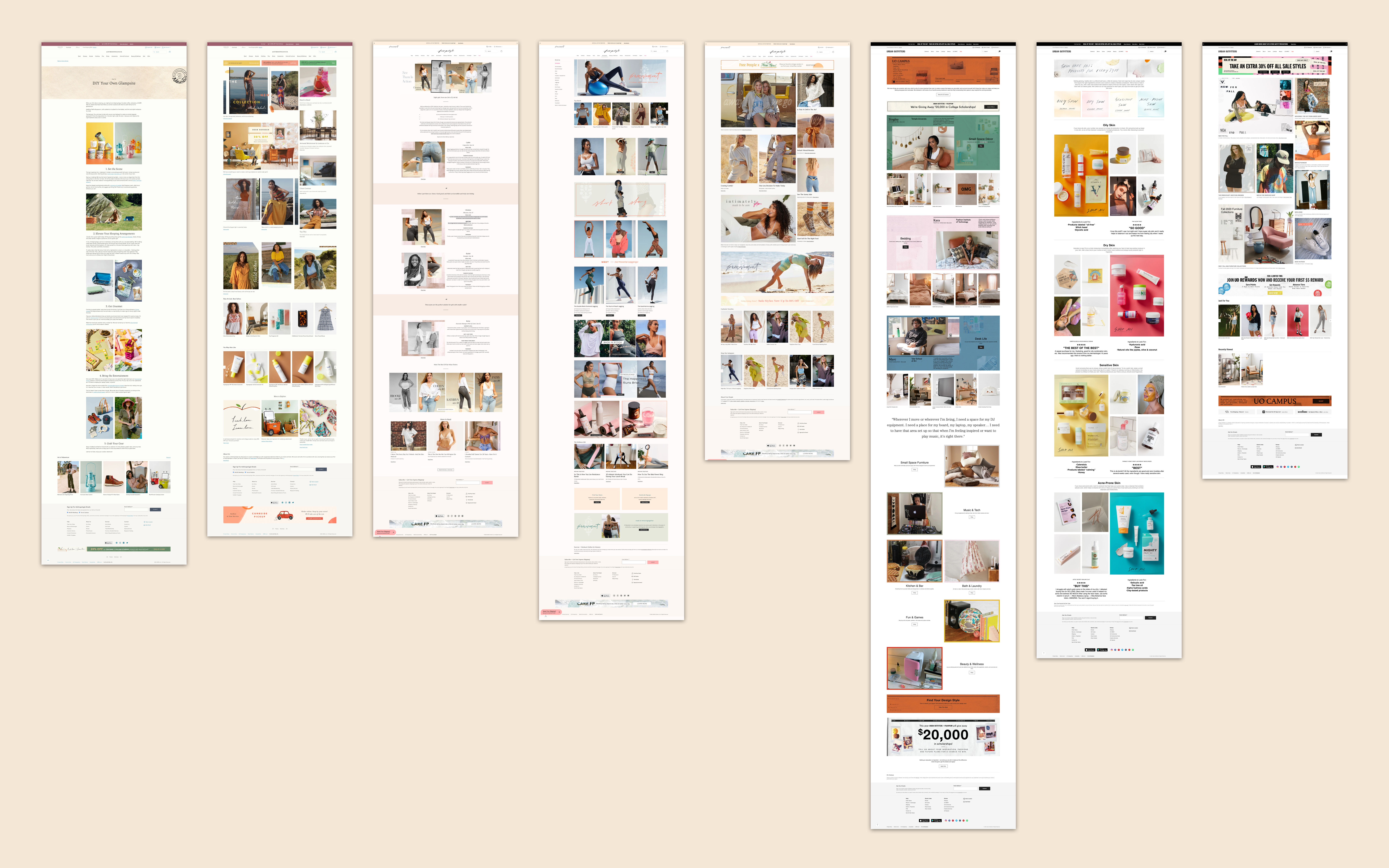
Visual designs can differ on content pages that use the content component library.
What's Next?
Outcomes
1. The new editorial component is the most used content component on the sites.
2. Combining the editorial component and text over image component into a singular component makes it easier for content owners and brand teams to create and update content in their CMS.
3. Development updates and QA checks are faster and streamlined.
Let's Chat
Phone: +01 732 789 5434
Email: tiffanysoohoo@gmail.com
© Tiffany Soohoo 2023
Product Designer & Strategist