2017
Opus College of Business
AGENCY
CLIENT
University of St. Thomas - Opus College of Business
MY ROLE
UX Designer & Content Strategist
TEAM
Anthony Robinson - Director of Digital
Hannah Dillon - Associate Creative Director
Erica Benamy - Interactive Designer
Greg Spraggins - Developer
Brendon Reyell - Developer
PROBLEM STATEMENT
How might we simplify, componentize and modernize an overly complex and outdated website to appeal to the next generation of business students?
BAckground
Tommie Tuesdays
Tommie Tuesdays symbolizes the pride that students have for attending University of St. Thomas in Minneapolis, Minnesota. The University of St. Thomas was a client of 160over90 and during the redesign of their main website, we began to notice a greater need to redesign and update their prestigious business school. The digital web presence lacked UX/UI and content strategy best practices.
#2
Top ranked undergraduate business program in Minnesota.
40%
of undegraduate students are Business Majors.
34,000
Alumni Worldwide
RESEARCH KEY FINDINGS
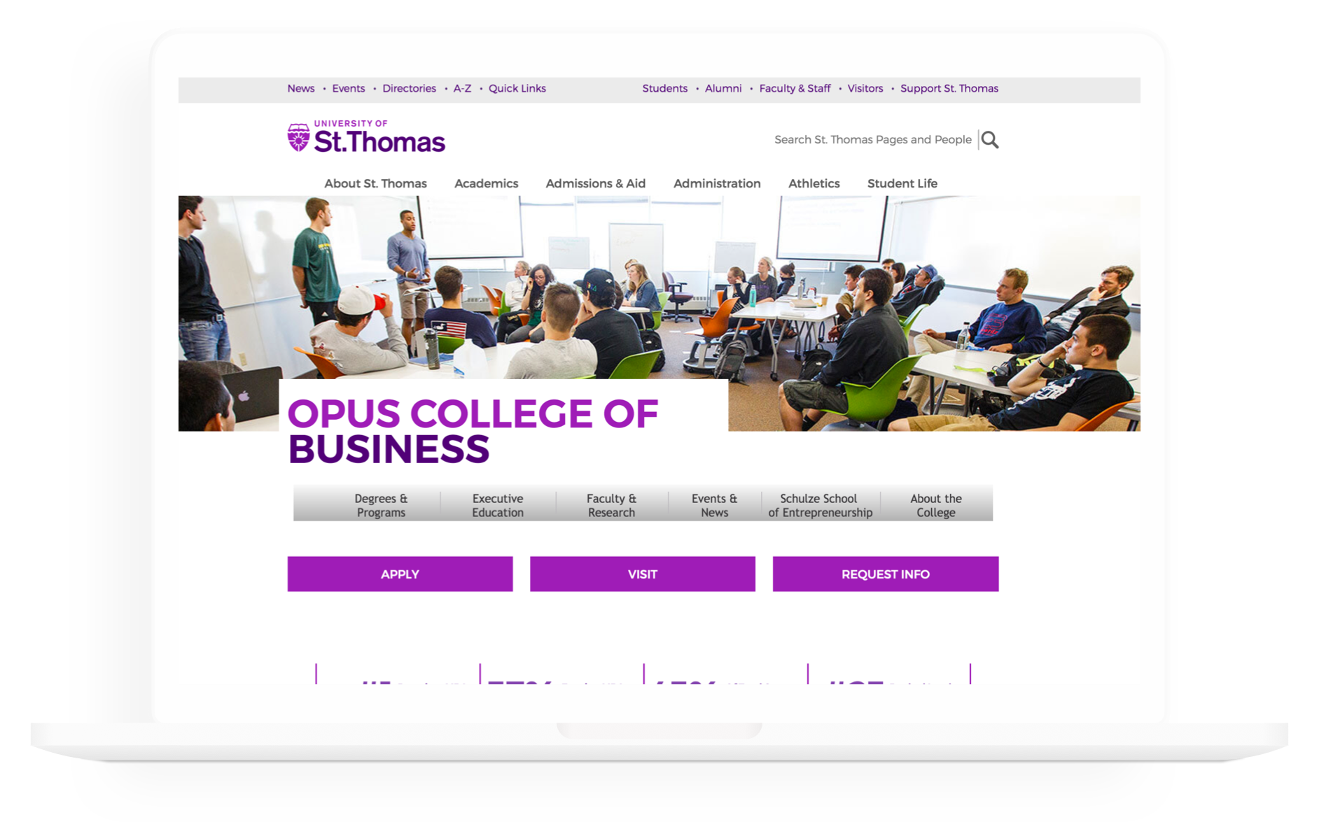
Current Site Audit
- Brand aesthetic is more playful than professional.
- Structure of the site is confusing as the main University of St. Thomas navigation is shown with the Opus College of Business School navigation.
- Imagery does not provide value or engage users.
RESEARCH KEY findings
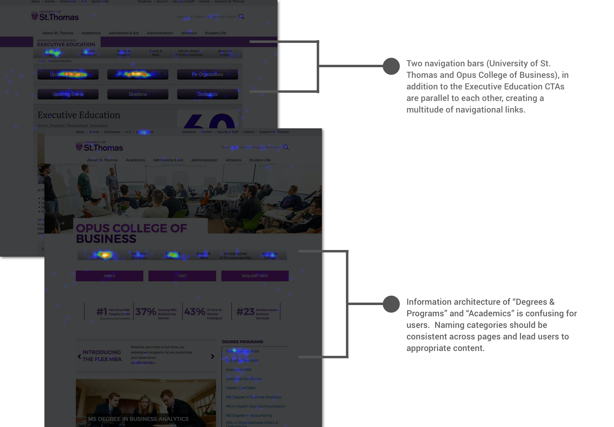
Heat-Mapping
- Users are clicking sporadically thoughout the pages and on similar navigational links.
- A user friendly design will help reduce the steps that users take to locate desired information.
REsearch Key Findings
Intercept Survey
- The site has many layers which makes relevant information buried within the site.
- Time consuming to read through the information on the site.
- Users have a difficult time navigating the site.
"In Executive Education, it's hard to quickly navigate to the site and go to where you want to be. Navigation is not intuitive at all and takes me a long time to find things. I just give up or wait until I can hop on a desktop."
Research Key Findings
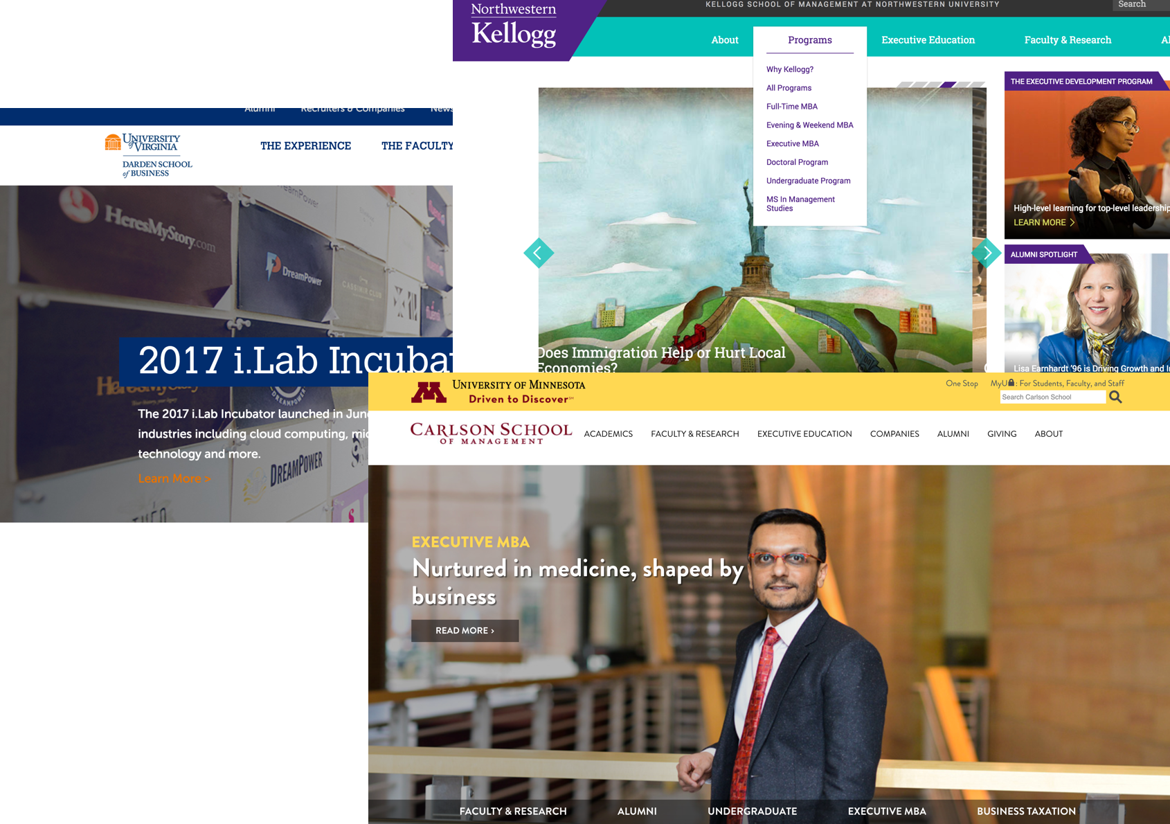
Competitive Analysis
- Competitive sites have a clear design system as it is consistent in typography, CTAs, colors and content modules.
- Visual design is professional and caters towards the main audience of prospective graduate students.
- "Outcomes" and "Experiences" sections show how the business school prepares students for life after school.
- Content is organized and engages users to want to learn more about the different programs.
Strategic recommendation
How can we strategically improve the Opus College of Business website?
The strategic recommendation was based on the research that was conducted.
1. Focus on the User Journey
Main users are prospective graduate students which differs from the University of St. Thomas main college site.
2. Site Navigation
Deviate from the University of St. Thomas site navigation and hierarchy structure by creating an organized and streamlined site architecture to help funnel visitors to relevant information.
3. Content Strategy
The content needs to serve a purpose and be consistent in tone, voice, and direction. Create a clear content strategy that promotes the different outcomes, experience, and the selling point of Opus.
4. Visual Design
Visual design should feel professional and elite while sticking to brand standards. The designs should be templated and fit within a componentized design system.
Information architecture
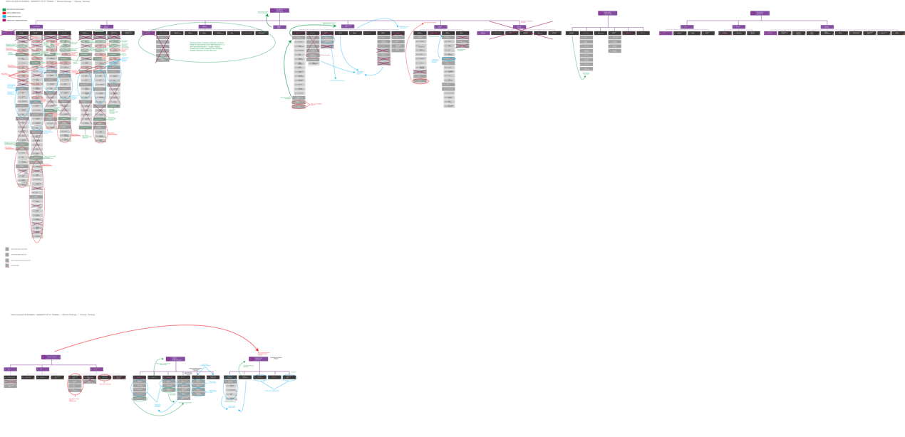
Current Site Navigation
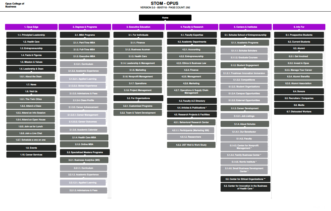
We want our clients to be able to easily digest the site architecture. We showed the current sitemap with annotations as to how to optimize the pages by either combining, moving, deleting or keeping the content. This exercise informed how visually complex the site was.
Ideal Site Navigation
The current sitemap exercise informed strategic decisions to create the new ideal sitemap. I combined and condensed areas to create a more simplistic and user-friendly site architecture. (Note - My company switched sitemap tools)
Information Architecture Key Takeaways
- Deleted any repeated information that is a better fit for a different section of the site.
- Improved the user experience by grouping similar information into new categories.
- Simplified the main navigation by restructuring the content into tiers.
- Created new pages to feature new aspects and selling propositions of Opus
- Standardized sections with similar content.
UX Design
Wireframes
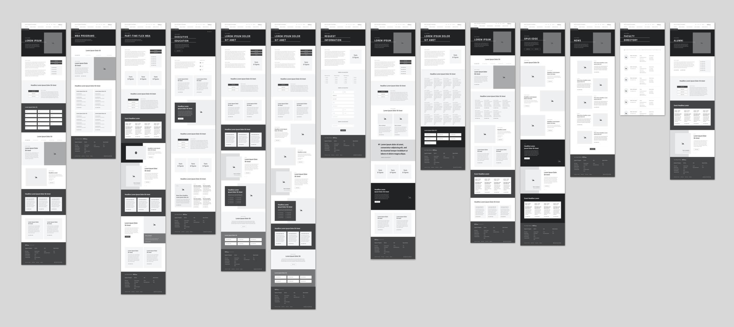
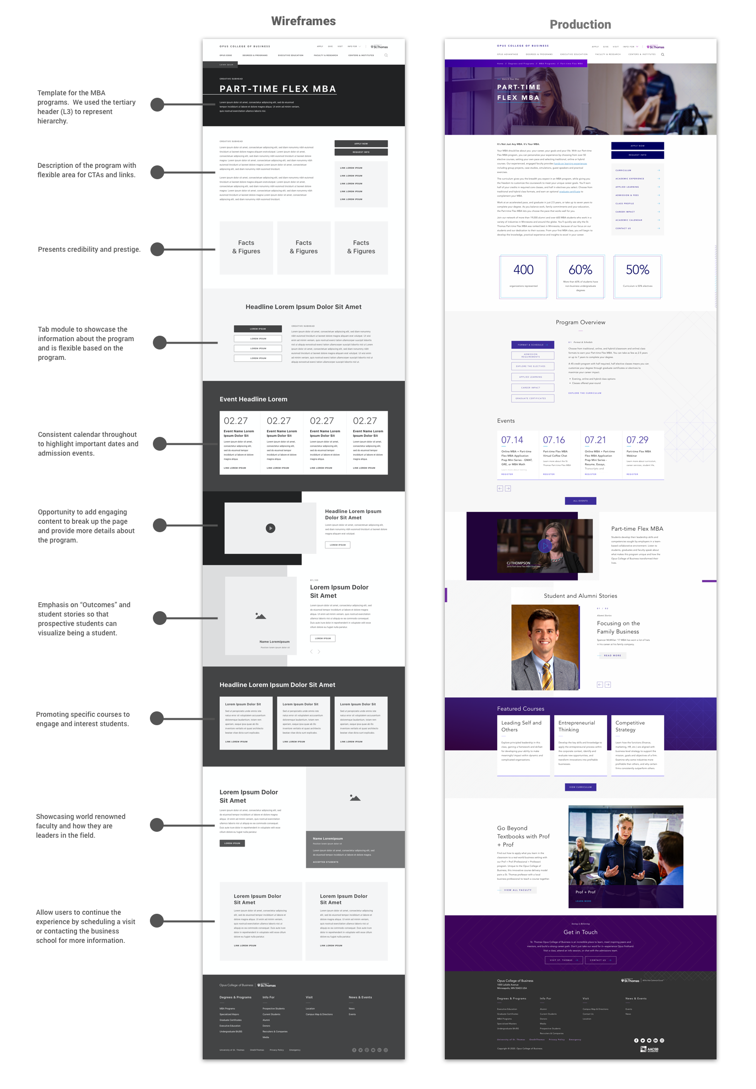
Collaborating with the Interaction Designer, we decided to create multiple levels of templates based on the ideal sitemap. We wanted to make sure that each page was accounted for and had a template associated to it. We created high level wireframes that reused content modules and kept patterns consistent. We wireframed all the different templates and assigned a number to each to represent the content strategy. Opus College of Business used our content heirarchy when building out pages on production.
CONTENT STRATEGY
Content Documentation
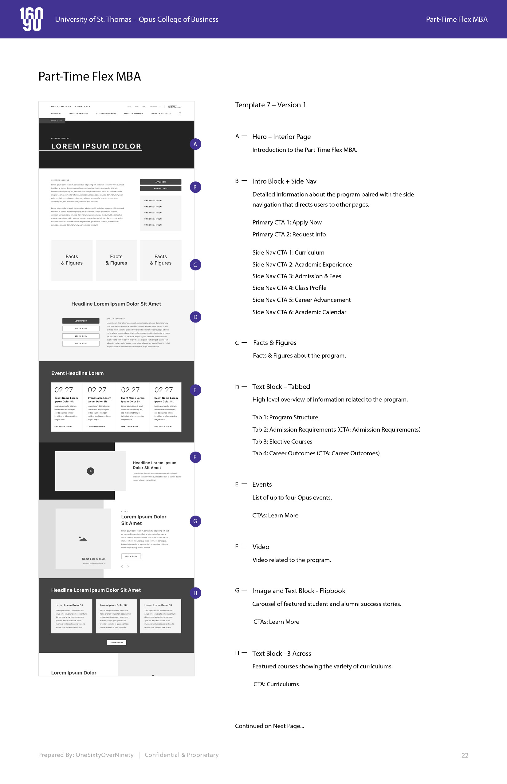
After delivering wireframes, our stakeholders were worried about how to amplify and strategically place the content on their site. Our agency did not have a content strategist at the time, so I collaborated on a content strategy documentation that the Opus College of Business digital team could use to create content for their new website.
- Created a 270+ page content strategy plan which documentented every wireframed based on the sitemap.
- Strategically considered which content modules would be most effective on each page.
- Focused on the user journey and user goals to create a holistic digital experience.
UI DESIGN
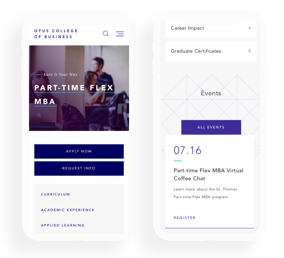
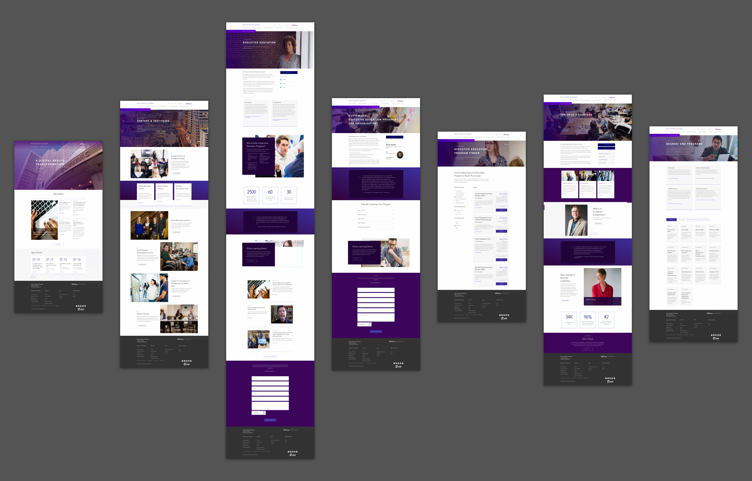
Visual Designs
I made sure the visuals reflected the overall strategy of the website. All of the UI Designs are taken from the production website.
WHAT's NEXT?
Outcomes
1. 1 to 1 content strategy was verbatim to what we proposed.
2. Increased enrollments and applications for Prospective Graduate Students.
Let's Chat
Phone: +01 732 789 5434
Email: tiffanysoohoo@gmail.com
© Tiffany Soohoo 2023
Product Designer & Strategist