2022-2023
Chuck E. Cheese Birthday Flow
AGENCY
Material+
CLIENT
Chuck E. Cheese
MY ROLE
Senior Product Designer
TEAM
Matt Michelson - Director of Product Design
Bridget Blakeney - Senior Product Designer
Christine Yun - Product Designer
Jeff Ponder - Content Strategist
PROBLEM STATEMENT
How might we create a streamline and user-friendly booking process for birthday parties?
BAckground
Birthday Experience
Chuck E. Cheese is known for their children's birthday parties. In the 2000s, Chuck E. Cheese rebranded themselves with award-winning technology, menus, and a robuts birthday experience. They became known as the Birthday Capital of the Universe™.
Throughout the years and especially during the COVID-19 shutdown, the party experience was declining. They realized that their current site was not up to the standards of the customers expectations and the digital experience was hindering signups.

Userflows
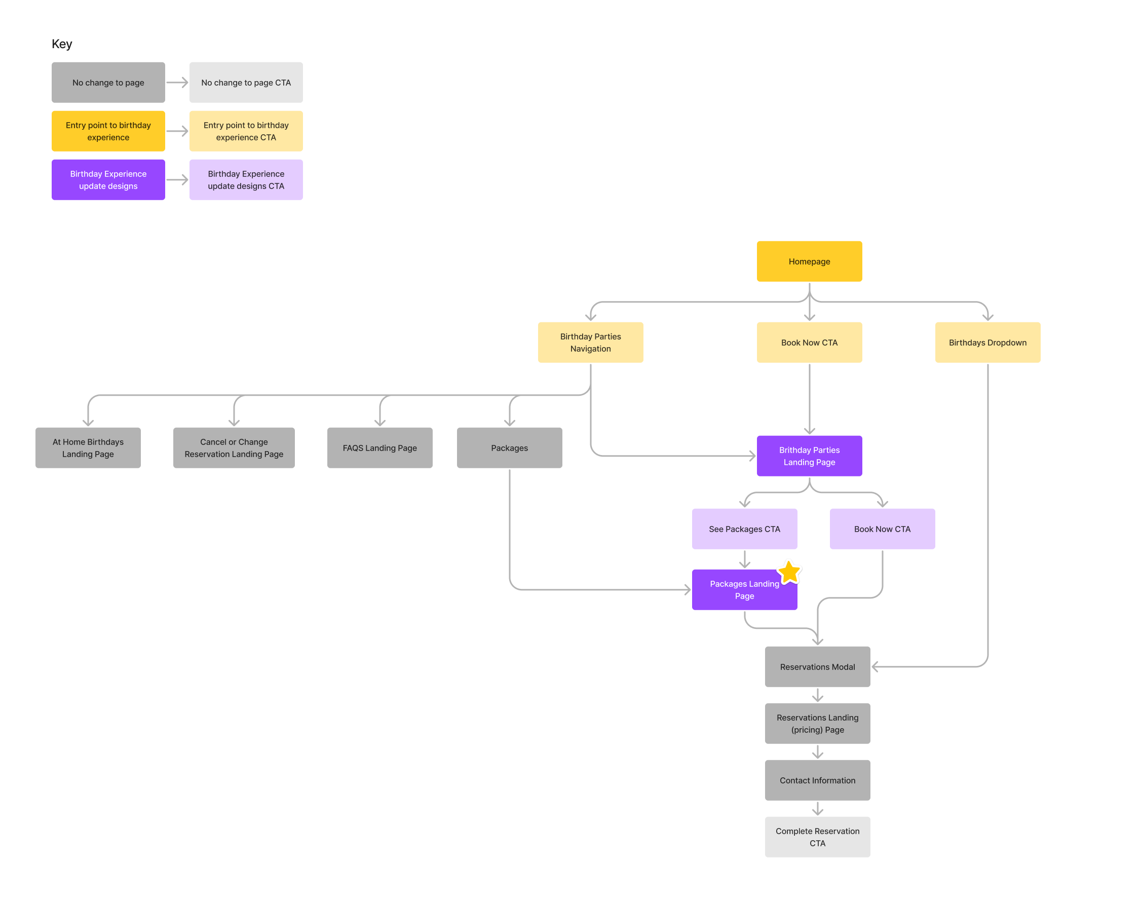
Current Flow
To fully understand the UX and information architecture of the booking flow, I started off by mapping out the current flow to figure out the best touchpoints a user crosses through the journey. This allowed the team to align on which sections to focus our design efforts on.
Userflows
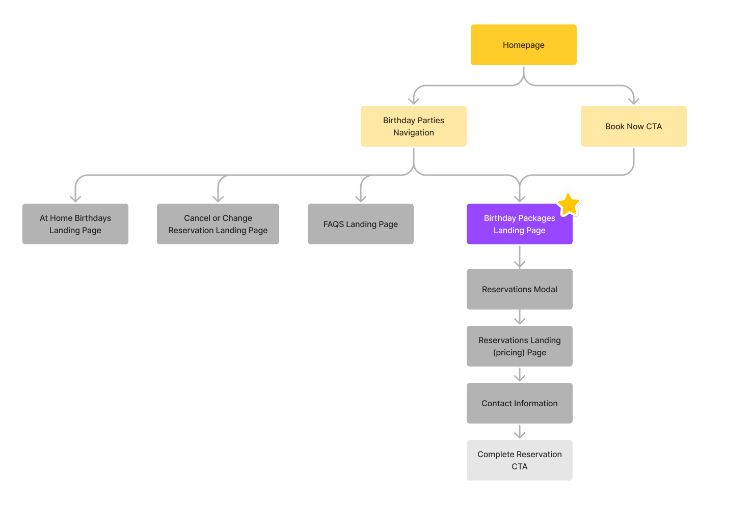
Ideal Flow
After creating the current flow, I began working on the ideal flow to simplify how users get to the booking experience. We presented this to the client so they could visually see how the flow could be simplified.
The goal was to streamline the process to make sure users could understand where they are in the booking flow and be able to complete the task.
COMPETITIVE & BEACON ANALYSIS
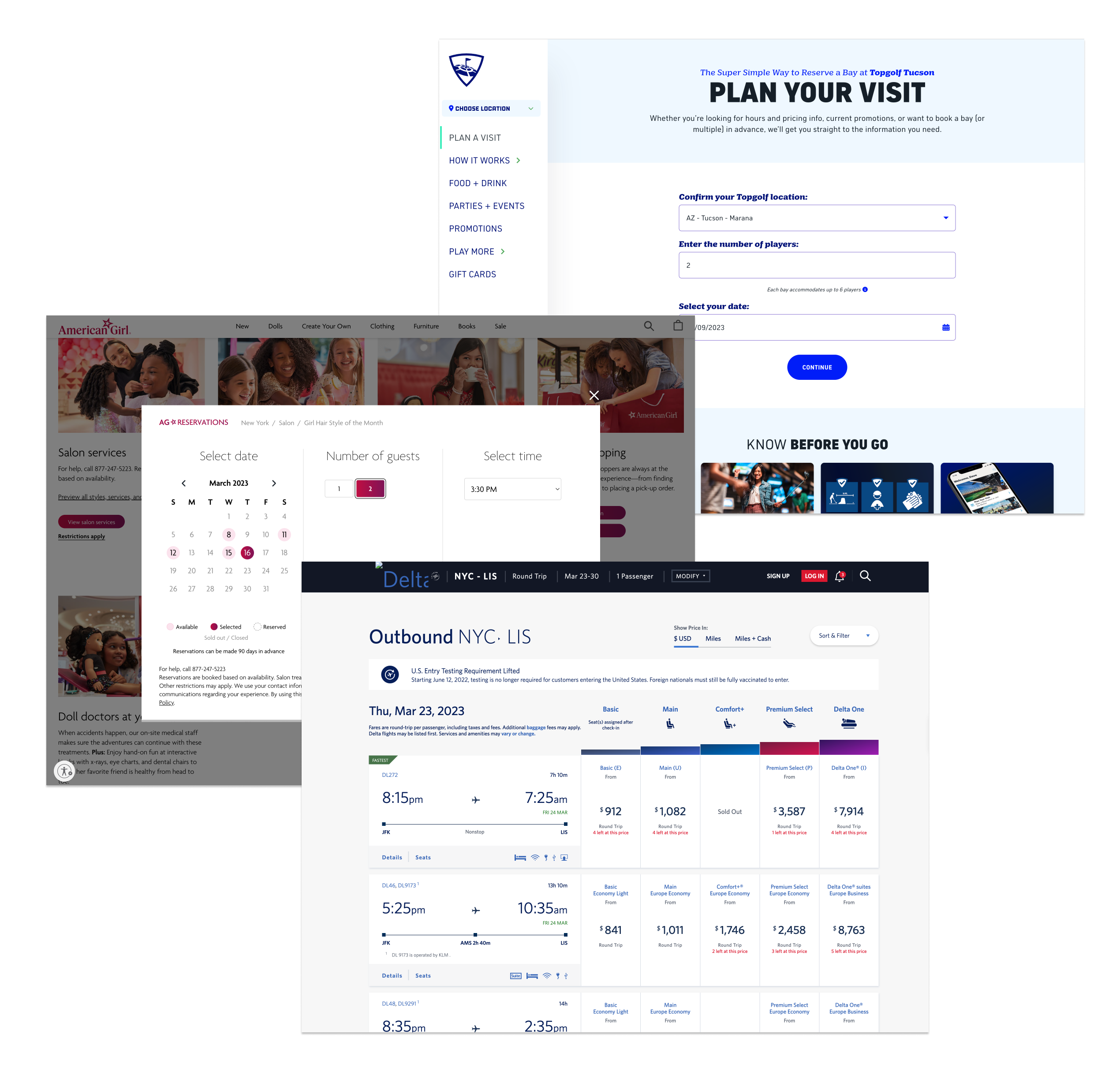
Benchmarking Booking Experience
We looked at other sites to understand how booking and pricing are displayed. This confirmed that booking sites are often complex however clear design hierarchy, standardization of elements, and informative copy can help guide the user through it.
APPROACH & PLANNING
Design Process
The design team worked in 2 week agile sprints to complete the work. We co-collaborated with the client to make sure all user and business needs and goals were met. The design team broke out the work into three distinct sections of the booking journey: Pricng Chart, Booking Flow, and Confirmation Product Page.
I was the lead product designer on the Pricing Chart and Confirmation Product Page while my co-designers led the booking flow. To be consistent, we collaborated daily to make sure that each of the sections were utilizing the same design system styles and interactions were consistent.
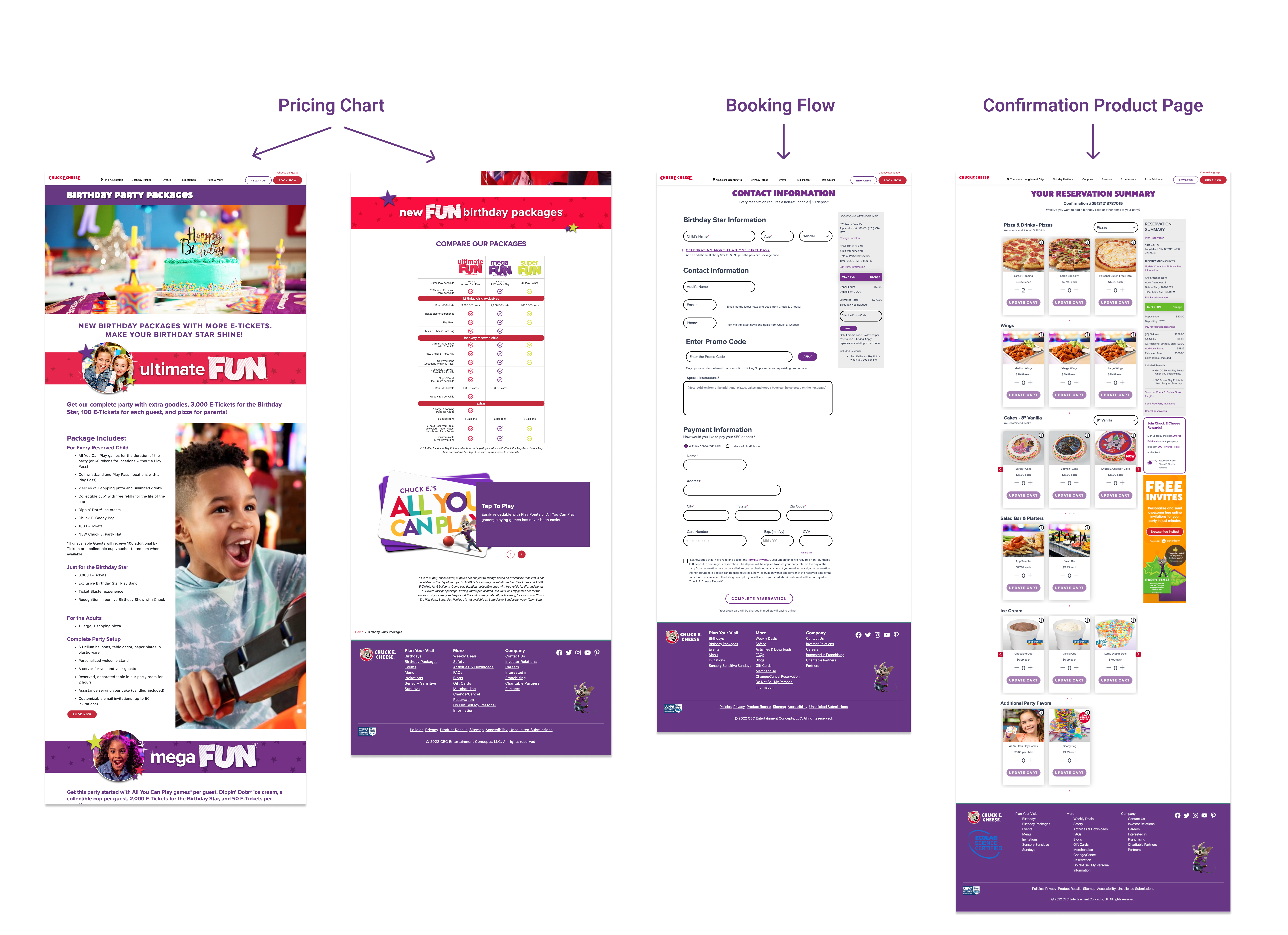
1. Pricing Chart
Starting entry point and landing page that tells users how much each package cost.
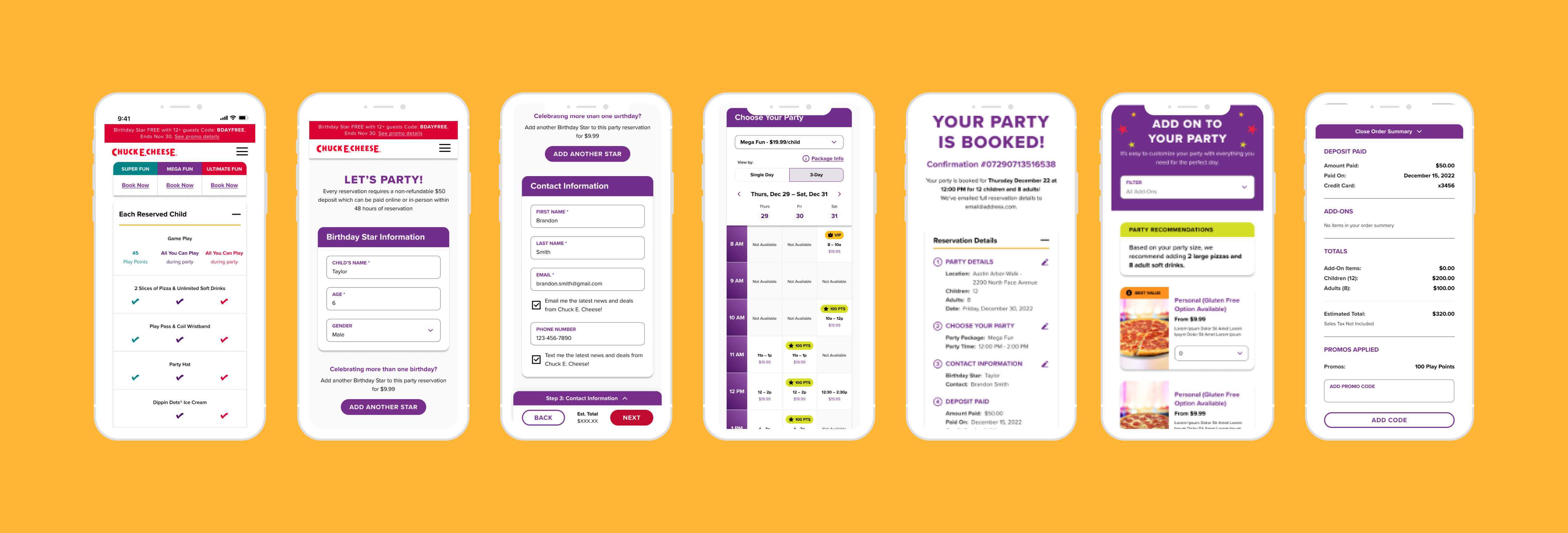
2. Booking Flow
Four step process to book a birthday party at Chuck E. Cheese.
3. Confirmation Product Page
Booking confirmation page which is also used as a way to upsell add-on products to enhance the birthday party.
SITE EVALUATION
Current Site Designs
As a team we conducted a heuristic evaluation to understand the successes and opportunities on the site and booking flow. Besides a visual design overhaul, we knew there were functionality requirements that needed to be addressed.
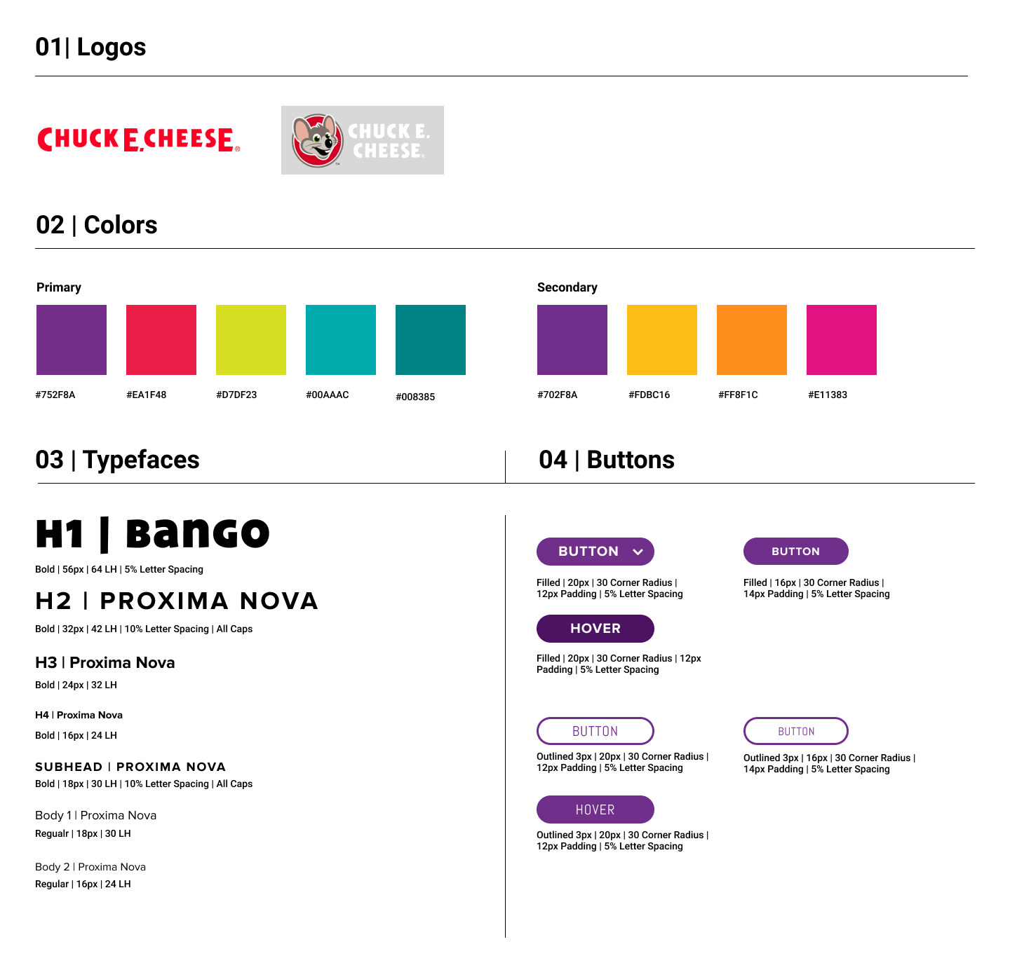
STyle Guide
Design System
Chuck E. Cheese had an early stage established design system and component library however it did not meet all the needs for the booking flow.
Part of our task was to clean up the design system by making sure visual designs and elements were AA accessible. We added a a few colors to their design system and improved We updated standard elements such as buttons and form fields and improved global elements.
UX/UI DESIGNS
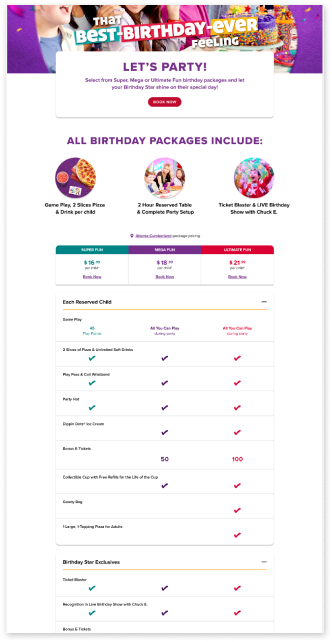
Pricing Chart Landing Page
Through our research we learned that the main driver for a user is understanding how much the birthday would cost. The pricing chart is the entry point for the booking experience so it was optimal that we made it visually clean and information was clear.
Challenges:
- Chart was featured very low on the page.
- Chart was difficult to read and comprehend at a first glance.
Solution:
- Collaborated with content strategy to make sure each of the sections and made sense.
- Created a more comprehensive and information organized chart.
- Focal part of the landing page to easy accessibility.
- Pricing and CTAs are prominent.
UX/UI DESIGNS
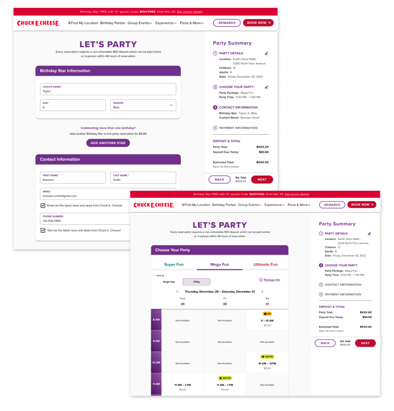
Booking Flow
The booking process starts with information about the birthday star, picking a time and date for the party, contact information, and payment information. Our goal was to streamline this flow to make sure users could focus and understanding how long the process would take.
Challenges:
- Confusing for users to know where they are in the booking process.
- Lack of visibility on the cost and what times were available for the party.
Solutions:
- Created a step by step navigation to go to the next step.
- Ability to clearly see the progression.
- Added multiple views such as Day View and 3-Day View so that users are able to select what time works the best for them.
UX/UI DESIGNS
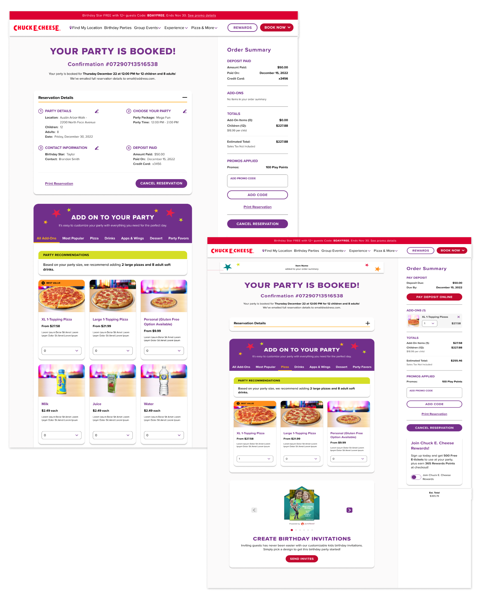
Confirmation Product Page
Once a user goes through the booking flow, the last section is the confirmation product page. This page doubles as a party confirmation page and also a way for users to add-on more items to enhance the party. This page is the main driver of traffic from the post-booking experience to the start of the party.
Challenges:
- Ability to add-on items was confusing and disjointed from the overall booking process.
- Different types of users will be driven to this page. A user who just booked a party, one who wants to change information about their party, and one who wants to add-on items to enhance the party.
- These users could come back to this page at anytime up to the party start date.
- How to incorporate an ecommerce product page functionality and how that information is saved if a user is going through different channels to edit their party information.
Solutions:
- Understand the hierarchy of the features to make sure that each type of user is getting to the right content.
- Prioritize the information that users deem relevant and be able to have less important information still be available on the page.
- Introduce standardized ecommerce patterns such as quantity, categories, adding to cart etc. to make sure users would understand the functionality of adding additional items.
What's Next?
Outcomes
5.2%
Uptick since 2019 and out of the red from the previous two years during the January 2023 launch
45% to 53%
Click through rate improved
6.4% to 5.6%
Booking rate went up
“Our new package chart designed by Material went live on September 6… our click through rate into the funnel and book rate increased around that time. There is seasonability to the business that may also be impacting bookings [...] but it seems very clear that the packages pack is easier to navigate”
- Spokesperson for Chuck E. Cheese
Let's Chat
Phone: +01 732 789 5434
Email: tiffanysoohoo@gmail.com
© Tiffany Soohoo 2023
Product Designer & Strategist